")
Alright, let’s talk about something I wrestled with recently. I was looking at this project, could be a game scene, could be a render, doesn’t matter. Point is, the lighting just felt totally flat. You know the look? Everything’s kinda evenly lit, no real drama, no depth. It just sat there looking boring.
My first instinct, like probably most folks, was just to crank up the main light source. Make it brighter! Yeah, that didn’t work. It just made everything washed out. Still flat, just… a brighter flat.
Okay, so brute force brightness isn’t the answer. What next?
Digging into the Setup
I started really looking at my lights. Not just the main one, but everything contributing.
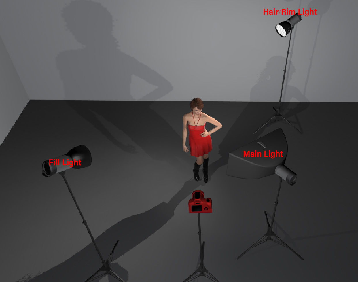
- The Key Light: This is supposed to be your main dude, right? I realized mine was maybe too soft, or maybe pointed too directly at the subject, like a flash photo. I repositioned it, gave it a more definite angle, maybe 45 degrees off to the side and slightly up. I also played with its intensity, making sure it was clearly the strongest light.
- Ambient Light: This is often a culprit for flatness. If it’s too high, it fills in all the shadows, killing contrast. I dialed mine way back. Sometimes you barely need any, or you can use a skybox or environment light instead which often looks more natural.
- Shadows: Were my shadows even working right? I checked the settings. Sometimes shadows are turned off, or the distance is wrong, or they’re too faint. I made sure shadows were enabled and tweaked their softness and darkness. You need shadows to show form. Harder shadows for drama, softer shadows for a gentler look, but you need them.
Adding Shape with More Lights
Just having one strong key light and reducing ambient wasn’t quite enough. The shadows were now maybe too dark. Everything looked stark.
So, I started adding supporting lights:
- Fill Light: I put a much weaker light on the opposite side of the key light. Its job isn’t to create new shadows, but just to gently lift the darkness in the shadows cast by the key light. You want to see some detail in there, not just black holes. Big, soft source, low intensity. Made a huge difference in making things feel solid but not crushed.
- Rim Light (or Kicker): This was the magic touch for separation. I added a light behind the subject, pointing sort of towards the camera (but not directly into it!). It catches the edges, creates this bright outline. Suddenly, the subject popped right out from the background. No more feeling stuck together. This one can be pretty focused and sharp.
Color and Final Tweaks
It still felt a bit sterile. So, I messed with color temperature. Gave the key light a slightly warm tint (like sunlight) and the fill or ambient light a slightly cool tint (like skylight). Just subtle changes, but it added a lot more life than pure white light.
I also looked at the environment itself. Making sure materials reflected light realistically. Maybe added some subtle fog or atmospheric effect way in the back to push the background further away and add depth. Adjusted post-processing too – a bit of contrast boost, maybe some bloom on the bright spots.
It took a lot of back-and-forth. Tweaking intensity here, moving a light there, adjusting shadow darkness, changing colors slightly. There wasn’t one single button press. It was about building layers: defining the main light, carving out shape with shadows, filling those shadows gently, separating the subject with a rim light, and then adding color and atmosphere.
End result? No more flatness. The scene had depth, shape, and mood. Felt way better. Just gotta keep layering and thinking about how light works in the real world, kinda.
")


")


