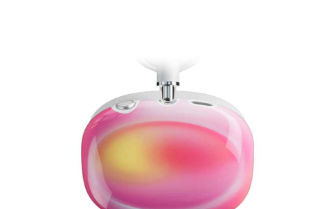
Alright, let’s talk about this little project I called ‘pinkaura’. It wasn’t anything too complex, more of a personal exercise to get a specific visual feel I had in mind. It all started pretty simply, really.

Getting the Idea Rolling
I just woke up one morning thinking about creating a soft, glowing effect, specifically with pink tones. Not harsh neon pink, but something gentler, almost like a soft light leak or an aura. So, I decided to just sit down and try to make it happen. Didn’t have a grand plan, just wanted to see if I could capture that feeling digitally.
First Steps and Tools
Fired up my usual setup. I tend to stick to tools I know well when I’m just messing around like this. Avoids getting bogged down in learning new stuff when the focus is just on the creative part. I opened my graphics editor and a basic coding environment I use for quick visual tests.
My initial thought process went something like this:
- Start Simple: Just get a pink shape on the screen.
- Add Softness: Make it less like a solid shape and more like light.
- Introduce Variation: A single flat color wouldn’t cut it.
- Maybe some movement?: Static is okay, but dynamic might be better.
Trying Things Out
First, I just put a pink circle down. Looked exactly like what it was: a pink circle. Definitely not an aura. So, the next step was crucial: blur. I started applying different levels of Gaussian blur. That immediately helped soften the edges, making it look less defined, which was good.
But it still felt flat. A real glow usually has a brighter center, fading outwards. So, I switched from a solid color to a radial gradient. I tried a few combinations:

- Bright pink center fading to a darker pink.
- White center fading to pink.
- Light pink center fading to a slightly darker, less saturated pink.
The last one felt closest to what I was picturing. Getting the gradient transition smooth took a bit of fiddling.
Adding Life to It
Okay, it looked soft and had some depth, but it was static. I wanted a subtle pulse or shimmer, something to make it feel more organic. I jumped into the code side for this. I experimented with slightly varying the opacity over time, using a slow sine wave. That gave it a gentle ‘breathing’ effect. Then I tried adding some very, very subtle noise or distortion that changed slowly, just to break up the perfect smoothness of the digital gradient. This made it feel a bit more natural, less mathematically perfect.
I also played around with layering. Maybe two or three slightly different blurred gradient shapes on top of each other, each with slightly different timing on their opacity pulse. That added a nice complexity to the shimmer. It wasn’t just one thing pulsing, but a more complex, interacting glow.
Refining the Look
Getting the color right was a constant back-and-forth. I kept tweaking the exact shades of pink in the gradient, the overall brightness, and the saturation. Too bright, and it felt harsh; too dark, and it lost the ‘aura’ feel. Finding that sweet spot took a good chunk of time, just adjusting sliders and looking at it, then adjusting again.
I also tweaked the size and intensity of the blur and the speed of the pulsing effect. Too fast was distracting, too slow was barely noticeable. It’s always a balancing act with these things.

The Result (For Now)
So, after all that tinkering, I ended up with something I’m pretty happy with. It’s a soft, gently pulsing pink glow. It uses gradients for depth, blur for softness, and subtle timed opacity changes plus a bit of noise for that dynamic, organic feel. It captures that ‘pinkaura’ vibe I initially thought of. It’s not ground-breaking stuff, but it was a satisfying little exercise, going from a vague idea to a concrete visual. Just a nice little practice session, really.


