
Yesterday, I spent a whole afternoon messing around with Lightroom. I wanted to figure out every single setting in it, you know? I grabbed a bunch of photos I took from my last trip and just started playing with the settings.
First off, I imported all the photos into Lightroom. It was pretty straightforward, just clicked “Import” and selected the folder where I stored all the pictures. Then I started with one photo and went through each setting one by one.
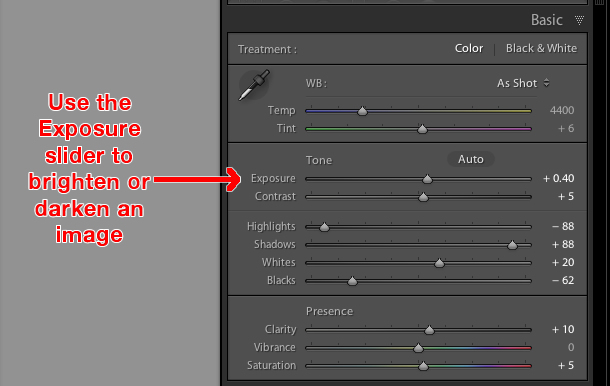
- Basic Panel: This is where I messed with the exposure, contrast, highlights, and shadows. I like my photos a bit brighter, so I usually bump up the exposure a little. And I love playing with the contrast to make the colors pop more.
- Tone Curve: This one was a bit tricky. It took me a while to get the hang of it. I moved the curve up and down, trying to see how it affected the overall tone of the photo. I ended up with a slightly vintage look, which I thought was pretty cool.
- HSL/Color: Here, I adjusted the hue, saturation, and luminance of individual colors. I wanted the blues in the sky to be more vibrant, so I played around with the blue settings. It was fun seeing how much I could change the mood of the photo just by tweaking the colors.
- Detail Panel: This is where I sharpened the image a bit. I’m always careful with sharpening because I don’t want the photo to look too grainy. I also reduced the noise a little since some of the photos were taken in low light.
- Lens Corrections: I usually enable profile corrections here to fix any distortion caused by the camera lens. It’s a small change, but it makes the photos look more professional.
- Transform: This one is useful for straightening out any crooked horizons. Some of my photos were a bit tilted, so I used the guided upright tool to fix them. It’s pretty satisfying to see the lines become perfectly straight.
- Effects: I added a slight vignette to one of the photos to draw more attention to the center. I don’t usually use vignettes, but I thought it worked well for this particular photo.
- Calibration: This is where you can fine-tune the colors even more. I didn’t spend too much time here, but I did adjust the shadows tint a bit to give the photo a warmer feel.
After I finished with one photo, I copied the settings and applied them to the other photos from the same set. It saved me a lot of time. I made some minor adjustments to each photo, just to make sure they looked consistent. I tried to enable GPU support in the Preferences, but that didn’t really help. I also found a way to download the edited photos to my phone through the Lightroom app, which was convenient.
Synchronization
Once I’d tinkered and tweaked to my heart’s content, it was time to sync my edits across all devices. This is where I really felt like a pro, seeing my hard work seamlessly appear on my phone. It’s such a cool feature, being able to start editing on my computer and then pick up right where I left off on my phone or tablet. I didn’t realize how useful it was until this time.
Finally
In the end, I was really happy with how the photos turned out. I learned a lot about Lightroom and its settings. It’s a pretty powerful tool, and I feel like I’ve only scratched the surface. I’m excited to keep exploring and see what else I can do with it. I did some research online beforehand to make sure my laptop had enough RAM to run Lightroom smoothly. I heard the Classic version on Mac is the best, but I’m using Windows. Maybe I should switch over? Anyway, I’m gonna keep practicing and see if I can become a Lightroom master. Maybe one day I’ll even make my own presets, which I saw was one way to do it, or build a database of them or something.
")


")


