Alright folks, so I wanted to share this little journey I went down with trying out that dark and mysterious vibe for one of my recent design projects. You know, that kinda broody, shadowy look that feels like a secret club? Yeah, that one. Honestly, I kinda stumbled into it.

Got the Itch to Try Something Dark
It started kinda simple. I was looking at a website interface I built ages ago – bright blue background, cheerful orange buttons – standard happy stuff. Felt… kinda boring suddenly? Like maybe a bit too loud? Made me wonder what flipping the whole thing on its head would feel like. What if instead of shouting, it whispered? That got me curious.
So, I cracked open my laptop one random Wednesday evening. Didn’t plan anything fancy, just opened my design software and basically dove headfirst into the deep end.
Slapping on the Shadows
First thing I did? Killed the lights. Swapped that bright blue background for a deep, deep charcoal grey, almost black. Immediately felt different. More serious, heavy even.
Then came the colors. My usual brights looked completely wrong now, like neon signs in a library. Felt super jarring. Swapped them out for moodier stuff:
- Blues and purples: Went for deeper shades, like midnight oceans and bruised skies.
- Reds: Not fire engine anymore, more like dried blood or burgundy wine.
- Accents: Slipped in some metallic silvers and muted golds, trying for a cold, ancient treasure vibe.
It was fighting me at first. Colors didn’t wanna play nice together. Too dark? Too flat? Had to keep nudging them.

Making the Words Play Hide and Seek
Typing was next. My usual clean black text? Vanished on the dark background. Pure white felt blinding against the deep grey, like staring at a flashlight.
I started playing with off-whites – soft creams, pale greys – trying to find something readable but not harsh. Also tried thinner, elegant-looking fonts instead of my usual bold ones. Made things feel more refined, less shouty. Increased the spacing between letters too, giving words room to breathe in the darkness. Seemed less crowded that way.
Throwing in Some Mystery
Wanted that feeling of secrets, you know? The “something hidden” sense.
So I messed with shadows a lot. Made buttons and boxes seem like they were floating slightly above the deep background, with soft, blurred shadows beneath them.
Used subtle gradients too – not rainbow nonsense, but slow shifts like dark grey fading into a deeper black, barely noticeable until you look closer. Added tiny sparkles here and there, like little stars in the void.

My favorite trick? Setting important stuff, like a call-to-action button or a headline, with a tiny, almost imperceptible glow or a very slight highlight. Makes your eye go there first without yelling about it.
Seeing if it Actually Worked
After fiddling for way longer than planned, I actually put this new dark interface in front of a few people. Was nervous – honestly thought it might feel depressing or hard to use.
Turns out, nope. People got hooked.
- One friend said it felt way more “high-end” than my usual cheerful stuff.
- Another mentioned it seemed calmer, easier on their eyes late at night.
- Mostly, they agreed it felt interesting. Made them wanna look around a bit more, like peeking behind a curtain.
Honestly surprised me. All I wanted was a mood change, but it seemed to pull people in deeper. Less scrolling fast, more slowing down to actually see things. Plus, that cool, kinda serious feeling stuck around.
What Stuck with Me
The whole thing was kinda messy, throwing paint at the wall to see what stuck. But man, the results? Way better than I expected just aiming for something “dark.”

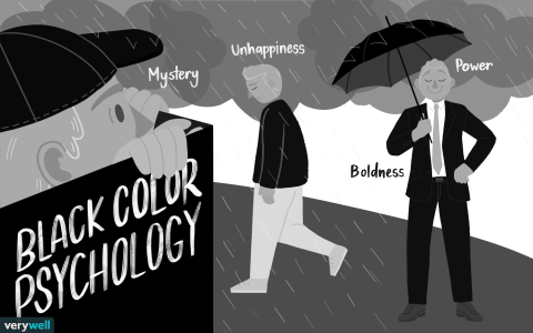
Turns out it’s not just about making things black. It’s about creating a specific mood, a sense of atmosphere. You’re setting a stage. Used right, that darkness pulls you in, makes things feel a bit unknown, a bit intriguing. Makes you look closer than you normally would. My bright, cheerful site? Felt friendly. This dark version? Felt like it had something cool to share, but only if you paid attention.
Would I do it again? Absolutely. Not for everything, obviously. But when you want something that feels a bit special, a bit secretive? Yeah, digging into those shadows works way better than I ever thought just messing around that Wednesday night.


