
Alright folks, grab a coffee because today I gotta talk about something that finally clicked for me in Lightroom. Yeah, I know, HSL? Sounds fancy. But honestly, I used to skip right past that panel like it was haunted. Total mystery box.
My Dumb Struggle Before HSL
Here’s how it usually went down. I’d pull up a portrait shot. Skin tones looking kinda weird, maybe a bit orange, maybe kinda flat. Maybe the green grass in the background looked dull. I’d jump straight to the main sliders: Temp, Tint, maybe fiddle with Vibrance or Saturation. Boom! Slam the saturation up hoping for magic.
Big mistake. What happened?
- Suddenly the entire photo looked like a cartoon. Like someone threw neon paint everywhere.
- That weird orange skin? Now it’s radioactive orange.
- The red sign in the background? Screaming louder than anything else.
- And that dull grass? Still kinda blah, but now everything else was distracting.
Felt like using a sledgehammer when I needed a scalpel. Frustrating as heck. I was ruining good photos trying to fix one stupid thing.
Flipping the Switch to HSL
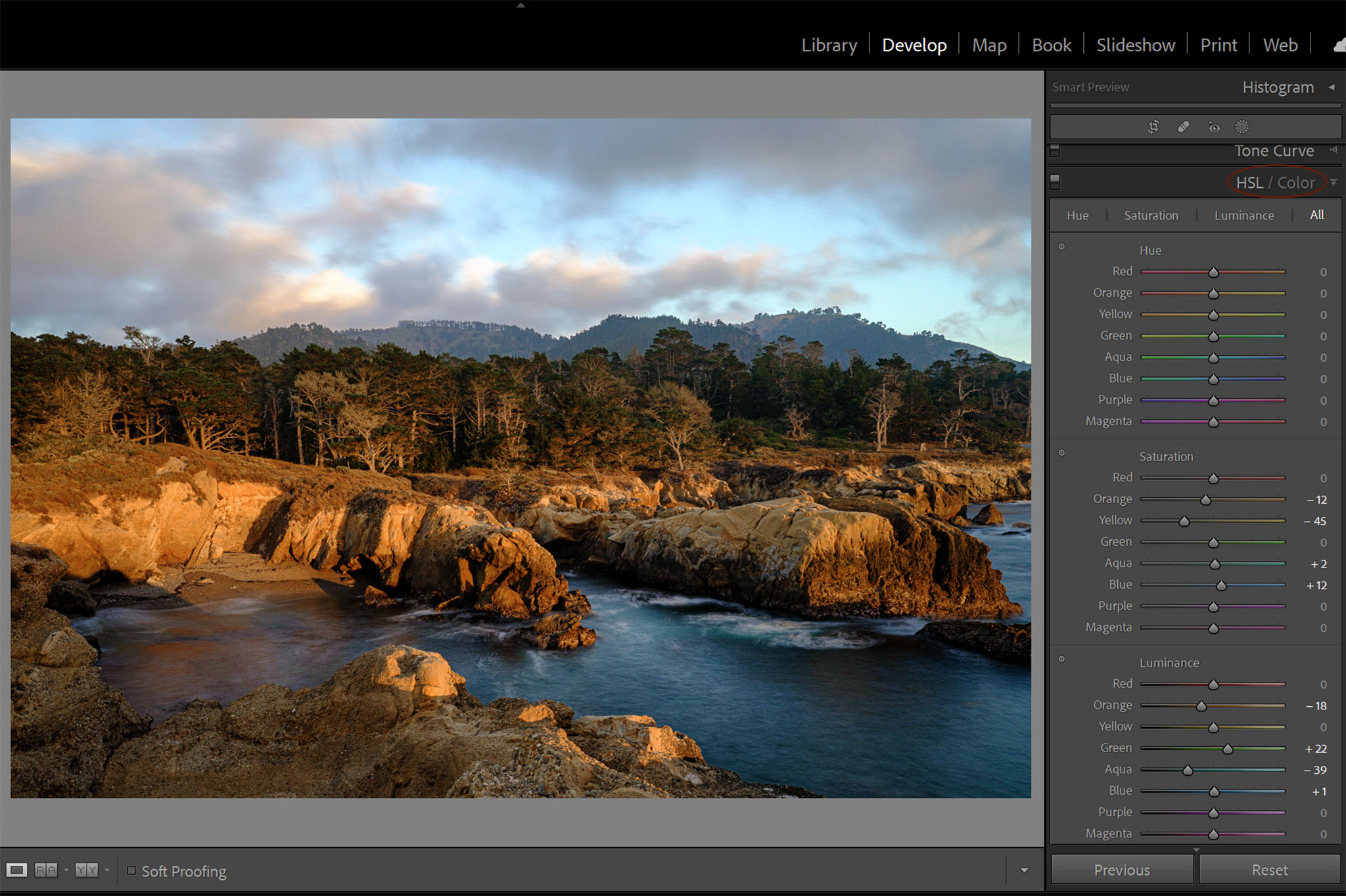
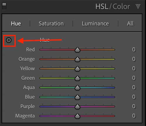
After wrecking enough shots, I figured, fine, let’s poke the HSL bear. What’s the worst that could happen? More neon? Ha! Clicked open that little HSL/Color panel. Saw those rows of colors: Reds, Oranges, Yellows, Greens, Aquas, Blues, Purples, Magentas.
Took a deep breath. Remembered my problematic photo.
- Targeting that Nastly Orange Skin: Found the “Oranges” slider. Carefully bumped the Saturation down a touch. Like, maybe -10. Stared at the screen. Holy cow! The orange glow calmed down! But the lips? Still looked okay. The red sign? Still had color. Only the orange skin got tweaked. Mind slightly blown.
- Waking Up the Sad Greens: Scrolled down to “Greens.” Instead of that global Saturation hammer, I nudged the Saturation slider just for greens up +15. Bam! The grass and leaves popped! But the rest of the photo? It stayed chill. No screaming reds or blues. Just… better greens.
- Fixing Weird Blue Shadows: Had this other shot where shadows under some trees looked too cyan, kinda unnatural. Found “Aquas” and “Blues.” Played with the Hue sliders a tiny bit. Moved the Aquas slightly more towards blue and the Blues slightly more towards teal. That weird cyan cast? Gone. Shadows looked more natural, deep blue-black. Without messing with the blue sky or anything else.
Why Bother? The Three Big Wins I Found
So after actually using HSL instead of just staring at it, here’s why it became my new best friend:
- Target Only What’s Wrong: Stop wrecking the whole photo! Seriously. Got a problem with reds? Fix just reds. Yellows too loud? Tame yellows. It’s like having tiny surgeons for each color. Global sliders feel like clubbing seals in comparison. Messy and brutal.
- Control is Insane: Don’t just make things ‘more colorful’ or ‘less colorful.’ You can actually shift the color slightly (Hue), or change how vivid it looks (Saturation), or make it brighter/darker (Luminance). It’s three tools per color group! Need the green leaves brighter without making them neon? Hit the Greens Luminance up. Skin looking muddy? Maybe lift the Reds/Yellows Luminance gently. It fixes stuff I didn’t even know could be fixed.
- Subtlety Wins: Because you’re only adjusting specific colors, you can be super gentle. Small tweaks make a huge difference without looking over-processed. Photos start looking ‘nicer’ or ‘punchier’ without anyone knowing exactly why. That’s the magic sauce – fixing problems nobody sees, just feels.
Seriously, ditching the global slammers and learning to aim with HSL saved my editing sanity. Took a minute to stop being scared of it, but now? It’s the first place I go when colors feel off. Give it a real try!
")


")


